How Power BI Integrations Create Seamless Enterprise Reporting Across Business Systems

The value of Power BI is not the dashboards, it is that the numbers in them come from across your disconnected systems and agree with each other. Most enterprises do not lack reports; they have too many, each pulled from a different system, none of which reconcile, so leadership argues about whose numbers are right instead of acting on them. Power BI earns its place when it unifies those sources into one trustworthy view. The hard and important work is the data layer underneath, not the visuals on top. i3solutions has built this where the reporting draws cleanly from multiple systems at once.
Ask for a report in most enterprises and you will get three, from three systems, that do not match. Finance has one number, operations has another, and the spreadsheet someone maintains has a third, and the meeting becomes a debate about whose export is correct rather than a decision based on the data. This is the problem Power BI actually solves, and it is worth being precise about it, because the problem is not a shortage of charts. It is the absence of a single, trustworthy version of the numbers.
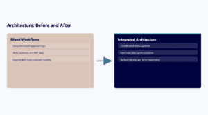
Power BI delivers that single version by connecting to the systems where the data actually lives, your line-of-business systems, SharePoint, Dynamics, databases, and bringing them together into one model that reconciles them. The dashboards are the visible part, but they are the last and easiest part. What makes the dashboards trustworthy is the work beneath them: connecting the sources, reconciling the fields that mean the same thing under different names, resolving the duplicates and mismatches, and building a data model that produces one consistent answer. For a federal defense agency and for an aerospace and defense manufacturer, i3 built Power BI reporting that drew from multiple systems at once, including reporting that spanned Dynamics and SharePoint together, and in both cases the value was the unified, reconciled view rather than the charts themselves.
This is also where the honest warning belongs, because Power BI makes it easy to build a beautiful dashboard on top of data that is wrong, and a beautiful dashboard on wrong data is worse than no dashboard at all. It manufactures false confidence: people trust a polished, authoritative-looking report and make decisions on numbers that do not actually reconcile underneath. The failure mode of a Power BI project is not an ugly chart, it is a clean-looking one that nobody checked the foundations of. That is why the data layer is the project and the visuals are the finish, and why a Power BI engagement that starts with dashboard design rather than data reconciliation is starting at the wrong end.
So the way to think about Power BI is as a reporting layer that is only as good as the data integration beneath it. Done right, it ends the whose-numbers-are-right argument by giving everyone one reconciled source, which is worth far more than the visual polish that gets the attention. The questions that determine whether a Power BI project succeeds are all about the data: which systems hold the truth, how their fields map to each other, how conflicts get resolved, and how the model stays current. Get those right and the dashboards take care of themselves. Get them wrong and the dashboards lie convincingly.
Key Takeaways
- Power BI’s value is one trustworthy, reconciled view across disconnected systems, not the dashboards themselves.
- The common problem is not too few reports but too many that do not reconcile, turning decisions into arguments about whose numbers are right.
- The real work is the data layer: connecting sources, reconciling fields, resolving duplicates, and building a consistent model. The visuals are the easy finish.
- A polished dashboard on unreconciled data is worse than none, because it manufactures false confidence.
- A Power BI project that starts with dashboard design instead of data reconciliation starts at the wrong end. (i3 built Power BI reporting drawing cleanly from multiple systems, including across Dynamics and SharePoint.)
Frequently Asked Questions
What does Power BI actually do for an enterprise?
It connects to the systems where your data lives and unifies them into one reconciled model, so leadership has a single trustworthy version of the numbers instead of conflicting exports from different systems.
Why do reports from different systems disagree?
Because each system holds its own data with its own definitions, and exports are not reconciled. The same field means different things in different places, so the numbers diverge. Power BI’s job is to reconcile them into one model.
Is building dashboards the hard part?
No. The dashboards are the visible but easy part. The hard work is the data layer: connecting sources, mapping fields that mean the same thing, resolving conflicts, and keeping the model current. That is what makes the dashboards trustworthy.
What is the biggest risk with Power BI?
A polished dashboard built on data that does not reconcile underneath. It looks authoritative and manufactures false confidence, leading to decisions on wrong numbers. That is worse than having no dashboard at all.
How should a Power BI project start?
With the data, not the visuals. Identify which systems hold the truth, how their fields map, how conflicts are resolved, and how the model stays current. A project that starts with dashboard design is starting at the wrong end.
If your leadership meetings turn into arguments about whose numbers are correct, the fix is not another dashboard, it is a reconciled data model underneath one. Bring us the systems your reports come from and we will build the Power BI data layer that makes them agree, so the reporting on top is something you can actually decide on rather than a polished version of the same disagreement.
About the Author
Michael Branson, Founder and COO, i3solutions. Connect on LinkedIn.