

Weekly and monthly status numbers were gathered by hand from spreadsheets and emailed documents.
The client is a global professional services firm. Through its extensive offerings in audit, consulting, financial advisory, risk advisory, and tax, the firm helps organizations worldwide address their most complex business challenges. Inside a firm of that span, the Office of the CEO holds the widest view of project work in the organization, and it wanted that view to be a real one: a dashboard view into project and milestone data across all projects company-wide.
What it had instead was files. Much of the project and milestone information was maintained in spreadsheets and static documents that had to be manually updated and emailed, creating version control issues and limiting real-time visibility. The firm was looking for a quick reference report that could help in viewing the health of its projects and improve the efficiency and timeliness of its decision-making process: real-time updates that would allow leadership to quickly identify potential risks and address issues before they escalated, and centralized key metrics that would enhance collaboration and support a proactive approach to project oversight.
A professional services firm’s leadership tracked project and milestone health by manually gathering numbers from spreadsheets and emailed reports every week and month. i3solutions built a real-time executive dashboard giving project managers and the CEO’s office the same live view.
Automated data compilation now replaces hours of manual spreadsheet gathering for monthly status reports, every addition compiles into a centralized database that keeps records current, and leadership can spot risks in real time and act before they escalate.

The Firm’s Project Status Lived in Email Attachments
A firm that helps organizations worldwide address their most complex business challenges ran its own project oversight on manually updated files. Each spreadsheet was current as of its last hand edit, and each emailed copy started aging the moment it was sent, which is where the version control issues came from: the Office of the CEO was reading about where projects had been, not where they were. Real-time visibility was limited by the medium itself, and no amount of diligence in updating the files could fix that.
Leadership defined what better looked like before defining a system. It wanted a quick reference report for viewing the health of its projects, real-time updates so potential risks could be identified quickly and issues addressed before they escalated, and key metrics centralized in one place to improve collaboration and make project oversight proactive. That definition pointed away from better documents and toward a different architecture: data entered once by the people who own it, compiled automatically, and read from a single live view.
No amount of diligence in updating spreadsheets could give this firm’s leadership current data, because emailed files are out of date on arrival. If your executive reporting still runs on emailed spreadsheets, that’s a structural problem, not a discipline one.
Decisions Priced in Compilation Time
The manual model charged for itself twice. First in production: every weekly and monthly update waited on someone gathering the numbers by hand, and that time and cost recurred on the reporting calendar. Project Managers spent hours on manual data compilation that could have gone to strategic tasks, and the administrative overhead landed on the same people responsible for delivering the projects being reported on.
The second charge was decision quality. Limited real-time visibility meant potential risks were not being identified quickly, and issues could escalate before leadership had the information to address them. Underperforming projects went without early identification and swift corrective action, and inconsistent copies of the status picture carried the risk of misaligned priorities across the enterprise. For an executive body whose job is the efficiency and timeliness of decision-making, data that was old on arrival was a structural handicap, not an inconvenience.
Two Audiences, One System, No New Silos
The system had to serve two very different users at once. The firm’s key Project Managers would be the data source, so entering and updating high-level project information had to be fast and intuitive: a user-friendly portal, not another reporting chore bolted onto delivery work. Executives sat at the other end with the opposite need: complex project statuses consolidated into a format that is straightforward and engaging, readable at a glance, with the ability to drill down into a specific project’s details when the status alone was not enough.
The integration constraint shaped the architecture as much as the audiences did. The dashboard had to build on the firm’s existing skills and resources and integrate with the various data sources and applications the firm already had, delivering a single, unified view of project performance across the entire organization rather than adding one more disconnected system. The scope was company-wide from the start: all projects, one centralized database, one view for the Office of the CEO.
Senior Microsoft Specialists with Proven Delivery Depth
The requirements defined the vendor profile: a team that could design and build a custom application spanning a data-entry portal, a centralized database compiling every change as it is made, and a Digital Dashboard executives would actually use, and integrate the result with the data sources and applications the firm already ran. Executive visibility work carries a specific burden: leadership decisions ride on what the dashboard says, so the data flow behind it has to be right.
The firm engaged i3solutions, a Microsoft Partner with 30 years of delivery experience and 1,500+ Microsoft engagements, delivered by an all-senior, all US-based delivery team. That profile matched the work: senior engineers who have built data-entry portals, centralized reporting databases, and executive dashboards repeatedly, and who could deliver a company-wide view on top of existing systems without asking the firm to replace them.
i3solutions built the custom application behind the executive view: a portal where the firm’s key Project Managers enter and update high-level project information, a centralized database that compiles every change as it is made, and a Digital Dashboard where leadership reads project health at a glance and drills down into the detail.
PHASE 01
Reporting Operations Assessment
i3solutions worked through how the status picture was actually produced: where project and milestone data lived across spreadsheets and static documents, who updated and emailed each file, and what the Office of the CEO needed from the replacement: a quick reference report on project health, real-time updates, and centralized key metrics across all projects company-wide.
PHASE 02
Portal and Centralized Database
i3solutions created an intuitive system in which key Project Managers enter and update high-level project information through a user-friendly portal. Each time project data is added or modified, it is automatically compiled into a centralized database, ensuring all records remain current and accurate and laying the groundwork for real-time reporting across the organization.
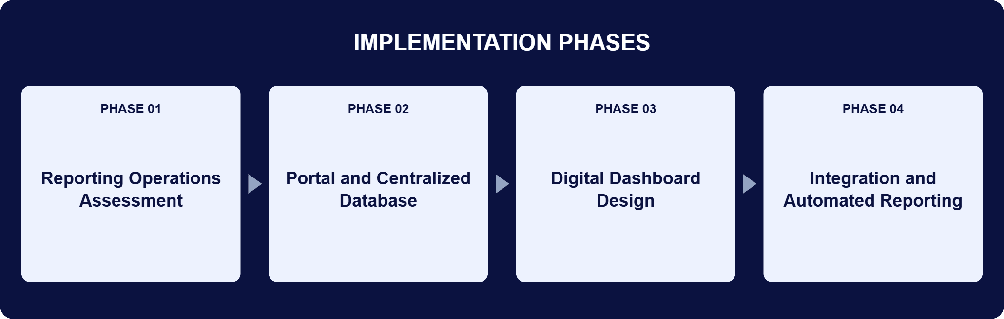
PHASE 03
Digital Dashboard Design
The data is presented through a Digital Dashboard designed to resemble an automobile dashboard. Visual cues in the manner of a stoplight or a fuel gauge consolidate complex project statuses into a format that is straightforward and engaging, so executives can gauge overall progress at a glance or drill down into specific project details.
PHASE 04
Integration and Automated Reporting
The dashboard was integrated with the various data sources and applications the firm already had, building on existing skills and resources to deliver a single, unified view of project performance across the entire organization. With data compilation and report generation automated, weekly and monthly updates stopped waiting on someone gathering the numbers by hand.
The application is three connected layers with the manual steps removed between them. At the entry layer, the firm’s key Project Managers add and update high-level project information through a user-friendly portal, which puts data maintenance with the people who own the work instead of with whoever assembles the report. The compilation layer is automatic: each addition or modification flows into a centralized database as it is made, so the records stay current and accurate without anyone reconciling versions, and the version control issues that came with emailed spreadsheets and static documents have nothing left to attach to. The presentation layer is the Digital Dashboard, designed to resemble an automobile dashboard: visual cues in the manner of a stoplight or a fuel gauge condense each project’s status for reading at a glance, with drill-down into a specific project’s details behind every status. Around those layers, the system integrates with the firm’s existing data sources and applications and builds on existing skills and resources, so the Office of the CEO gets a single, unified view of project performance across the entire organization, and automated data compilation and report generation produce the weekly and monthly updates the firm used to build by hand.

Status, Compiled Automatically
A centralized database and digital dashboard now give the Office of the CEO project and milestone health across every project, company-wide.
| Outcome | Before | After |
|---|---|---|
| Weekly and monthly status reporting | Numbers gathered by hand from spreadsheets and emailed documents | Automated data compilation and report generation, dramatically reducing the time and cost of each update |
| Data currency | Manually updated files, current as of the last edit | Every addition or change compiled automatically into a centralized database, keeping records current and accurate |
| Executive visibility | Static documents with version control issues and limited real-time visibility | A real-time dashboard view of project and milestone data across all projects company-wide |
| Risk response | Issues addressed after they had escalated | Real-time updates that let leadership identify potential risks and act before escalation |
| Project Manager time | Hours spent on manual data compilation | Real-time visibility, with Project Managers focused on strategic tasks |
The source of the change is structural, and the sourced results follow from it: with data compilation and report generation automated, the system dramatically reduced the time and cost associated with creating weekly or monthly updates, and the efficiency and productivity of the firm’s projects improved substantially. Project Managers gained real-time visibility and now put their hours into strategic tasks rather than manual data compilation, freeing up resources, improving collaboration, and reducing administrative overhead.
The decision-making side of the ledger is the reason the Office of the CEO commissioned the work. Real-time visibility into each project’s status lets executives identify underperforming areas early and take swift corrective action, hold teams accountable against clear, up-to-date metrics, and direct resources more effectively toward organizational goals. It also reaches further out: leaders can pinpoint problematic areas or underlying trends that could impact performance, and the same visibility that drives immediate action on underperforming projects supports better long-term planning. A single, easy-to-use portal gives every stakeholder consistent, accurate information, boosting cross-departmental transparency and reducing the risk of misaligned priorities across the enterprise.

PENDING-CLIENT-QUOTE
This engagement is relevant for
Less relevant for
Executive Visibility as a Data Flow, Not a Reporting Chore
The engagement established that a current, trustworthy executive view is an architecture question, not a diligence question. No amount of discipline in updating spreadsheets could give the Office of the CEO current data, because emailed files age by design.
Moving entry to a portal owned by the firm’s key Project Managers, compiling every addition and modification into a centralized database automatically, and presenting the result through a Digital Dashboard with stoplight and fuel-gauge cues gave leadership a single, unified view of project performance across the entire organization. The weekly and monthly updates that once waited on manual gathering are generated automatically at dramatically reduced time and cost, and the firm’s leadership addresses potential risks before they escalate instead of reading about them afterward.
A real-time executive dashboard replaces manually assembled status reports with a live view of project data. For this global professional services firm, i3solutions built it in three parts: a user-friendly portal where the firm’s key Project Managers enter and update high-level project information; a centralized database that automatically compiles each addition or modification, keeping records current and accurate; and a Digital Dashboard designed to resemble an automobile dashboard, where visual cues in the manner of a stoplight or a fuel gauge condense each project’s status into something an executive reads at a glance, with drill-down into specific project details behind every status. The defining property is that the view never waits on a person: because data compilation and report generation are automated, the dashboard reflects project and milestone data across all projects company-wide as it is entered.
The design works backward from the decisions the dashboard has to support. The Office of the CEO needed a quick reference report on the health of its projects and the ability to address issues before they escalated, so i3solutions shaped the system around those needs rather than around a chart library. Data entry sits with the people who own the work: key Project Managers update high-level project information through an intuitive portal, so keeping the dashboard current is not a separate reporting task. Compilation into the centralized database is automatic, which removes the manual gathering that made weekly and monthly updates slow and costly. The presentation condenses complex project statuses into a format an executive reads quickly, with drill-down for the reasoning behind a status. The dashboard also integrates with the data sources and applications the firm already had, building on existing skills and resources.
It is designed to resemble an automobile dashboard. Visual cues in the manner of a stoplight or a fuel gauge condense a project’s status into something an executive can read at a glance, and anyone who wants the reasoning behind a status can drill down into that project’s details. The format is deliberate for the audience: leadership asked for a quick reference report on project health, not another document to study, and condensing complex project statuses into a readable format is what makes the reference quick. The same visibility works at two time horizons. In the moment, it drives immediate action on underperforming projects, with executives identifying problem areas early and taking swift corrective action. Over time, it lets leaders pinpoint underlying trends that could impact performance, track progress, and allocate resources more strategically.
The Project Managers who own the work. They enter and update the high-level information in the portal, and compiling it into the central database happens automatically, so the records remain current and accurate without a reconciliation step. That replaced the manually updated spreadsheets and emailed static documents the firm had been relying on, along with the version control problems that came with them. The ownership model carries its own benefits beyond currency: a single, easy-to-use portal for data entry improves collaboration among Project Managers and ensures all stakeholders work from consistent, accurate information, which boosts cross-departmental transparency and reduces the risk of misaligned priorities across the enterprise. Because the compilation is automatic, the Project Managers supplying the data spend their time on strategic tasks rather than on manual data compilation.
In this engagement, that was a requirement, not an afterthought. The dashboard integrates with the firm’s existing data sources and applications and builds on skills and resources the firm already had, so performance across the whole organization arrives in a single, unified view rather than being assembled report by report. The integration is what turns a reporting tool into an executive instrument: the Office of the CEO reads one dashboard for project and milestone data across all projects company-wide, instead of waiting for numbers to be gathered by hand from wherever they live. It is also what kept the engagement practical for the firm: the system used what was already in place rather than demanding new platforms or new skills, and automated data compilation and report generation did the consolidation the firm had been paying for in manual effort.
i3solutions is a Microsoft Partner with 30 years of delivery experience and 1,500+ Microsoft engagements, with every engagement staffed by an all-senior, all US-based delivery team. Executive visibility work rewards that seniority: leadership decisions ride on what the dashboard says, so the data flow behind it, from portal entry through automatic compilation to the at-a-glance view, has to be right. This engagement is representative of the pattern: entry placed with the Project Managers who own the data, compilation into a centralized database that happens automatically with every change, a Digital Dashboard executives read at a glance with drill-down behind it, and integration with the data sources and applications the client already ran. For organizations weighing this class of work, a short scoping conversation establishes what a live executive view would take in your environment.
It works with what the organization already runs. The dashboard was built on the data sources, applications, and skills this professional services firm already had rather than as a replacement platform, pulling project and milestone health into one live view for the Office of the CEO instead of requiring a new system of record underneath it. That is what let status move from hand-compiled, emailed spreadsheets to an always-current view without a separate systems migration.
Automatic compilation into a centralized dashboard is what let this firm’s leadership see problems before they became bigger ones. We can talk through what a comparable executive dashboard would look like for your organization.

US-Based | Est. 1997
© i3solutions. All rights reserved.
US-Based | Est. 1997
© i3solutions. All rights reserved.


